Roam has always been my favorite PKM and right now nothing has supplanted it for me.
I still like looking at all the other new players to the game to see what unique things they bring to the table, but Roam has always been my solid rock that has all my favorite features. I can write and find things faster in it than in any other app so far.
But the mobile web app, visually, is a little difficult to use.
Their mobile web app actually isn’t that bad to use. It’s fairly fast, it has a quick capture function, and once it’s loaded you can use it without an internet connection for a while.
But one thing that’s tough with outliner apps is getting the toggle touch points right. Instead of just having text, you have to have a toggle, a bullet, and then text. That’s a lot of stuff to have on a screen. With a computer and mouse you have exact pixel precision so you can have things tighter. But with a touchscreen and your finger, you can’t because touch is less precise and your finger is larger than a mouse pointer. The touch points need to be bigger which is hard because you are already dealing with significantly less screen real estate.
But there are a few apps that have some great toggles on iOS. The one I like the most is Craft. Let’s take a look at Craf’s toggles:
The toggle has a lot of room to breathe and allows for imprecision when touching. Having some padding on the left and right allows the toggle to be bigger than what is actually shown allowing room for error. Sure, your text is starting further over on the screen, but that’s ok. You have to make some concessions on mobile.
Also notice the multibar. It’s right beneath the toggle once it expands. This gives more room to any children toggles that will be inside it.
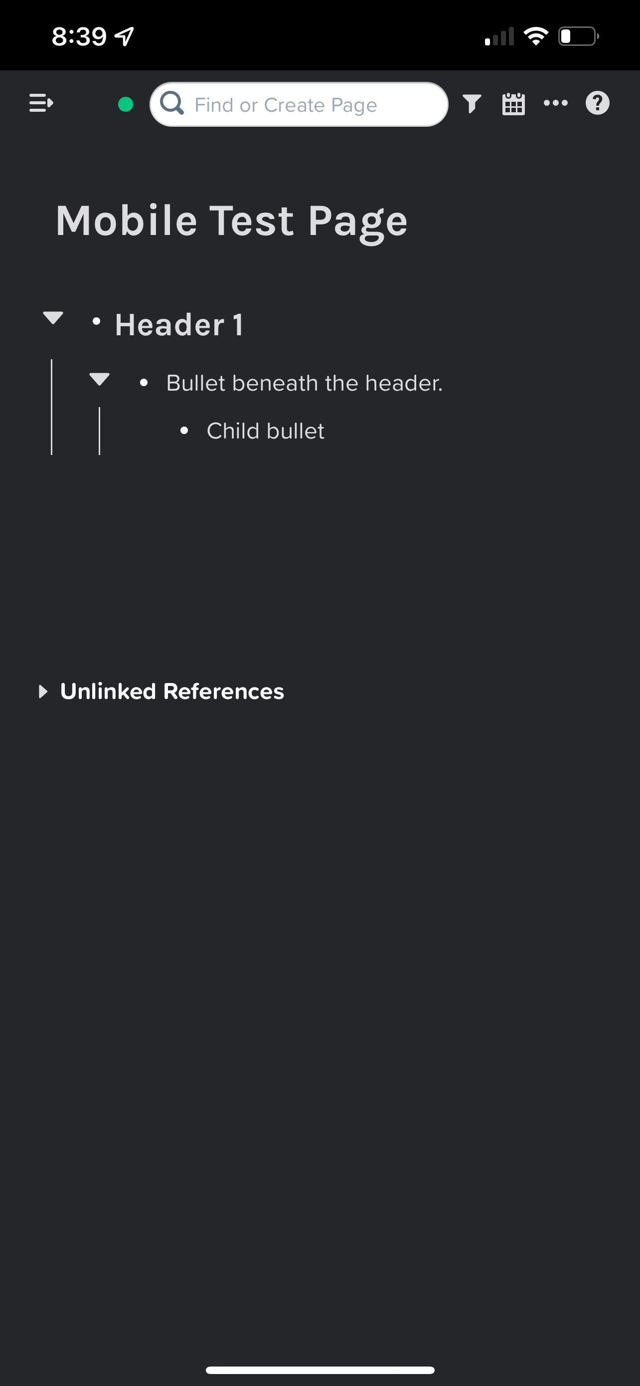
Now let’s look at Roam on mobile with no mobile-specific CSS:
The toggle is cut off which makes expanding the bullet super difficult. The children bullets are a little easier to touch, but the toggle is still small and the multibars are not allowing any room for error. It’s also super easy to accidentally touch the bullet to zoom in.
So I tried finding this by moving the bullets and text over a little and making the toggles bigger, but the multibars kept closing in on the children toggles. The only way I could make enough room for the toggle is to move the children bullets and text further to the right, but that got a little ridiculous at one point. I don’t want the text starting halfway over on the screen.
Then I thought back to Craft and their multibars and decided to see what it would be like to move the multibars beneath the toggles. I actually really liked it. It gave my toggles room to breathe without having to move the bullets further and further to the right. Here’s what that looks like:
It seems to be working great so far. The toggles have room to breathe and gives you room for error when trying to touch them.
The small problem now is that sometimes the toggles disappear depending on what you touch. But because you have the multi bars you can still know where to touch to activate the toggles. I tried doing some CSS to make the toggles always visible, which I can do, but it also makes a toggle visible on every single bullet even ones that don’t have any children.
So if anyone knows how to make the toggles always visible only on bullets that have children, let me know!
Keep in mind that I’m not really a coder so there could be some errors. Just let me know if anything isn’t working and I’ll see what I can do. But I think it should be pretty good. At least in my testing.
Hopefully this will make your Roam mobile experience a little better to navigate through.
Side Note: If you really want something different you can try removing the multi bars completely. That was one path I took and it actually worked out really well. But I found that I do like having them there. But you can just do a display: none to the .rm-multibar element and see what that does. It’s not that bad.
Thanks for reading!
Here’s the code:
@media (min-device-width:320px) and (max-device-width:767px) {
.rm-block__children.rm-level-0 .rm-block__input {
    margin-left: 24px;
  }

 /* Moves Bullets to the Right */
.roam-body .roam-app .roam-main .roam-article {
  padding: 16px 20px 120px 36px !important;
}

.rm-block__children.rm-level-0 .rm-bullet .bp3-popover-target {
 	margin-left: 14px !important;
}

.rm-block__children.rm-level-0 .rm-bullet {
    margin-left: 24px !important;
  }

 /* Moves Triangle to the Right */
.rm-block__children.rm-level-0 .bp3-icon-standard {
    font-size: 27px !important;
    margin-left: 9px;
    margin-top: -4px !important;
}

 /* Moves Multibar to the Right */
.rm-multibar {
  	margin-left: -2px !Important;
}

  /* Moves Master Multibar Off the Page */
  .rm-level-0>.rm-multibar:hover {
    margin-left: -12px !important;
  }
  .rm-level-0>.rm-multibar {
  /*  display: none !important;*/
    margin-left: -12px !important;
  }
  /* Moves Multibar to the right on Children */
  .rm-block-children.rm-block__children.rm-level-2 .rm-multibar {
  	margin-left: 3px !important;
  }


  /* Moves Bullet to the Right on Children */

.rm-block-children.rm-block__children.rm-level-2 .bp3-popover-target {
    margin-right: -19px;
  }

  .rm-block-children.rm-block__children.rm-level-1 .bp3-popover-target {
    margin-right: -26px;
  }

  /* Move Triangle to the Right on Children */
  .rm-block-children.rm-block__children.rm-level-2 .bp3-icon-standard {
    font-size: 27px !important;
  	margin-left: 27px;
}
  .rm-block-children.rm-block__children.rm-level-1 .bp3-icon-standard {
    font-size: 27px !important;
  	margin-left: 13px;
}

  /* Moves Text on Children to the Right */
  .rm-block-children.rm-block__children.rm-level-2 .rm-block__input {
 	 margin-left: 28px;
  }

  .rm-block-children.rm-block__children.rm-level-1 .rm-block__input {
    margin-left: 32px !important;
  }

  /* Moves Linked References section to the right for more space to touch the toggle */
  .rm-reference-container .flex-h-box {
    margin-left: 15px;
  }

  /* Makes the toggle triangle next to the linked references always visible */
  .rm-reference-container .rm-caret.rm-caret-hidden {
    opacity: 1;
    color: var(--text-normal);
  }

  }


Well, thank you very much, that's super useful! 🤓